As Art Director for ‘A
Matter of Life and Rent’ I was trying to create a perception of a very
grimy, dull unpleasant world within the aesthetics of the story. Even though
the story is set in modern day I wanted to create a very industrial eighties
appearance, a setting of filthy factories, dull grey smoke clouds, dirty
bricked terrace houses, colours that reflect rust, grittiness and gloominess. This
is because I believed this look for the film would work well with the dark
storyline and tone along with its dry and bleak humour used from the
characters.
The location used for the kitchen scenes in many ways helped me
achieve this task as it had features that fit in with my plans for the set
design. The house had a bland decoration design with no defining features or
characteristics. It had plain dark cream walls, unpainted, unvarnished wooden
doors, a wooden stable door as a backdoor and a fireplace wall with original
brick walls painted over in white. All this helped me plan the location around
my art design rather than have to set-up my art direction around the house.
However the kitchen did contain modern cupboards but I do feel that it didn’t
ruin the tone I was trying to achieve.
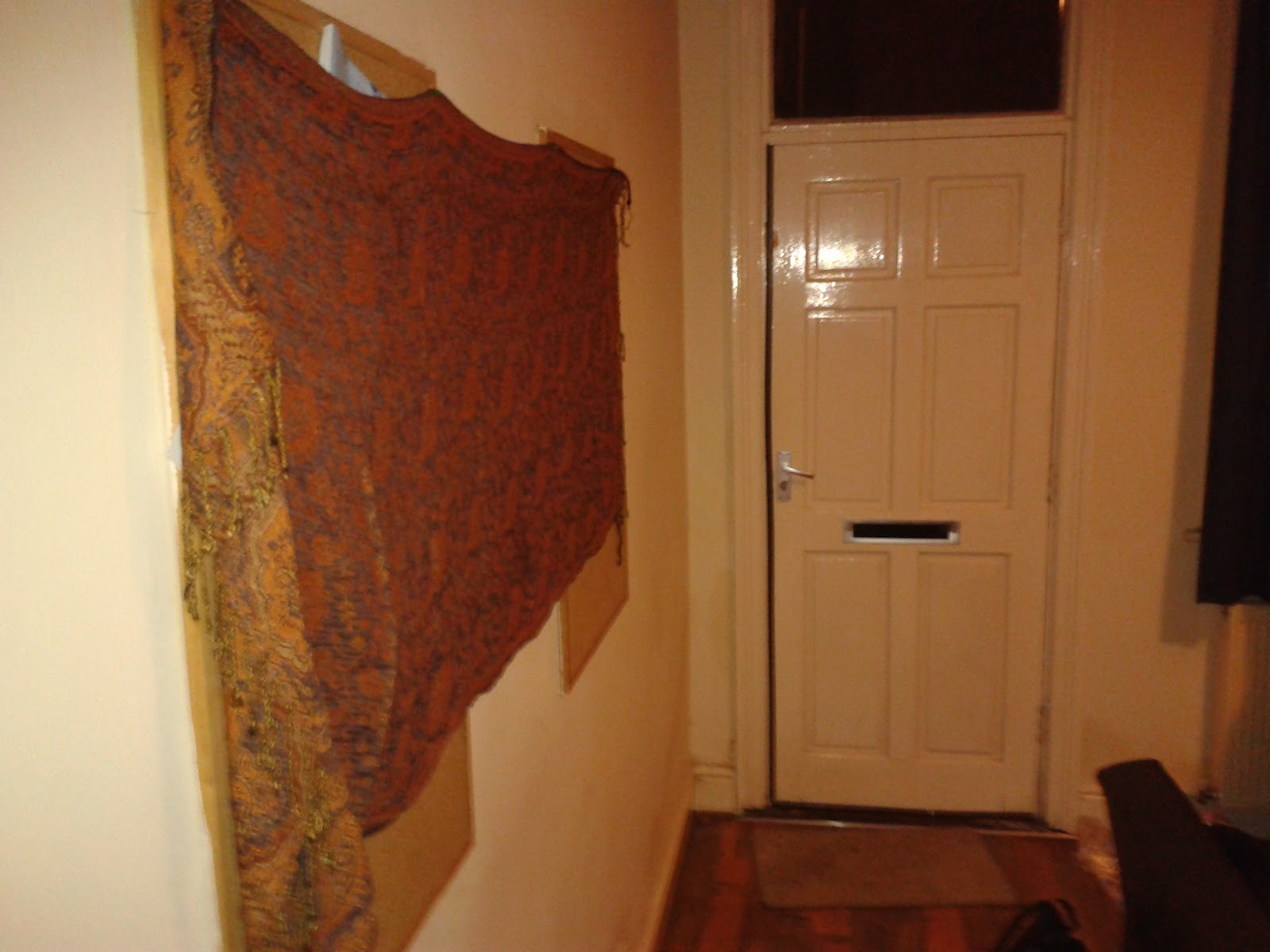
I used a number retro, unattractive clay pots, mugs and kitchen
accessories with different shades of grey and brown to clutter the kitchen
counters to make the impression of a dirty untidy appearance. There were
student notice boards on the walls which I covered with dull coloured rugs, I
thought this would help along with the props to defend the grimy design.
However watching the film back I believe the rugs don’t create this effect at
all but it does however I feel create an effect of a student ‘hippy’ house
which also works well with the dirty student house look without looking like unaesthetically
appealing student house.
I planned the costumes of the characters Adam, Max and Tony the
landlord from their personality and characteristics portrayed in the script. Adam,
who is very nerdy, guarded and shy I planned his costume to be very over
hanging (wearing clothes to big) washed out bland colours. I created Max’s
costume for him to be wearing a smart black shirt and tie to reflect his
confidence, coldness and selfishness and his actions towards the dark dilemma
within the storyline. Tony’s costume was
straightforward to create as the film was a follow on from the 2min film
exercise earlier in the year that focused on Tony only giving him more story
and emotion to Tonys character, who is killed at the very beginning of the ten
minute film. I used his costume used in the 2min film to work with his
character that is dark, cruel and idle.